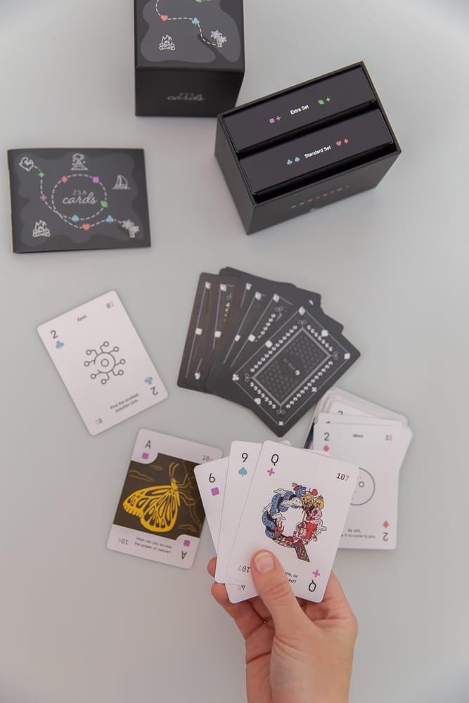
When you think about it, a deck of cards is an incredible thing: a complete gaming system that fits in your pocket. Wireless, no batteries required, with both single- and multiplayer games. It's a design icon, a tidy semantic package burnished to a deep shine by generations of designers and players.
So naturally, I wondered if we could make a better one.
I wanted a deck that let me play all of the classic games I can play with any other standard deck, but also do much more.
What's "much more," though? I started researching to answer that question. Some of the things I found:
- Rory's Story Cubes, a wonderful set of dice that's an analog story generator. Roll, and a tale unfolds.
- Oblique Strategies, a classic deck of creative prompts from Peter Schmidt and Brian Eno. Incredible inspiration in the moment.
- The Pairs card deck devised by renowned game designer James Ernest. This is a deck with ten cards of rank 10, nine cards of rank 9, right down to one single card of rank 1. Ernest designed a slew of games that use this structure and shares them for free right on the Pairs page.
- A whole bunch of "conversation decks," decks of cards designed to foster interesting conversations amongst friends and couples.
- The versatile and powerful Everdeck, a "universal card system" from talented designer Wilhelm Su, who ended up collaborating with us on the data design for ZSA Cards.
What if we could take all of these and merge their powers into a single package of wonder, a painstakingly designed "superdeck" that marries them all together while staying beautiful and cohesive?
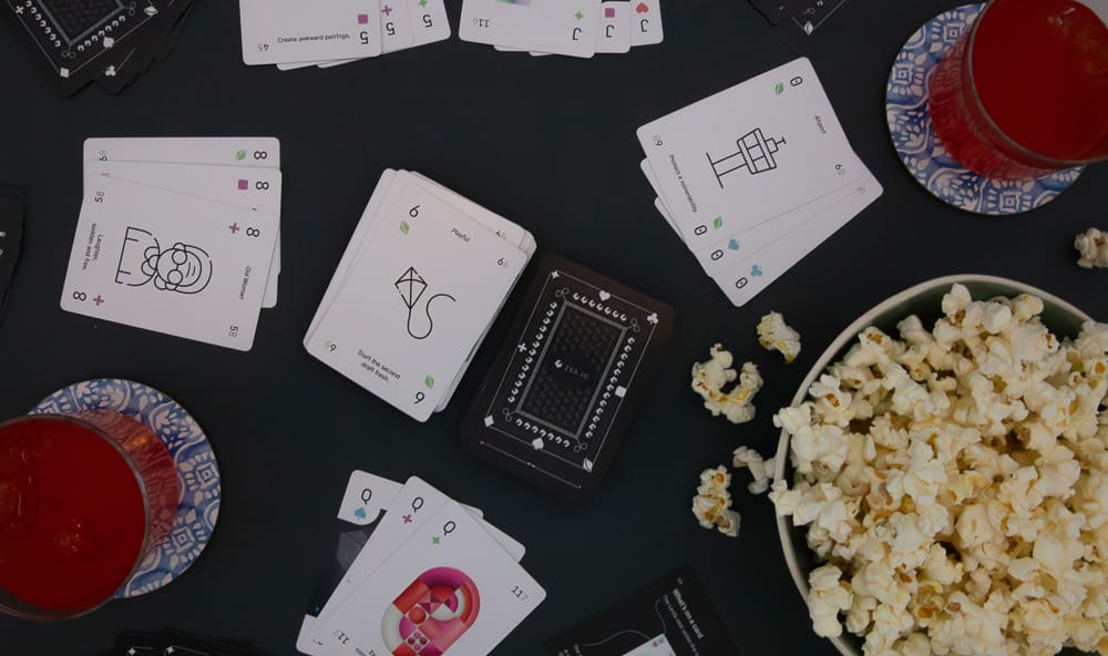
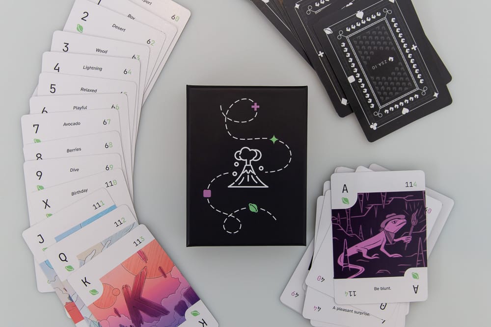
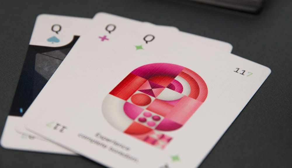
We spent over two years chasing this dream, grappling with this challenge in information and visual design. We ended up with the four traditional suits, and four new ones. Every card is packed with information, including a short thought-provoking phrase (a "prompt") and so much more. You can see the structure of the deck and many sample cards on the all-new ZSA.fun site. All of the prompts are original to ZSA Cards, unique to this deck.
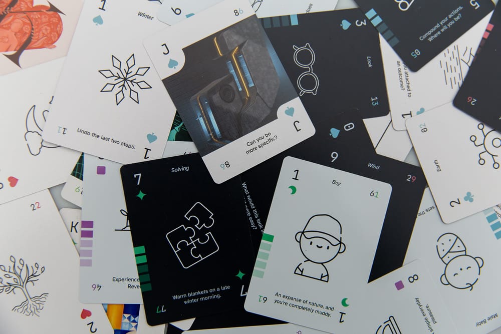
Once we had the initial design down, we recruited a cadre of nine talented artists to illustrate the face cards and the aces. The beautiful full-color illustrations are exclusive to the deck as well.
Then it was time to focus on the physical aspect: The quality of the printing and the feel of the cards. For many people, this is going to be the first ZSA "thing" they get to interact with in the real world (the price being much more accessible than our keyboards) so we needed to have a level of finish and tactility that reflects our values and care as a company.
We used USPCC (the lovely "Bicycle" cards) as our benchmark for card feel, rigidity, and surface texture. Specifically, we went with 310gsm card stock, with German black core. The finish is a glossy varnish with a beautiful surface texture, and the printing is offset printing (not "on demand" printing). The end result is a deck that feels decidedly premium in the hand and has a good shuffle to it (not aimed at cardistry, but definitely pleasant to shuffle and deal).
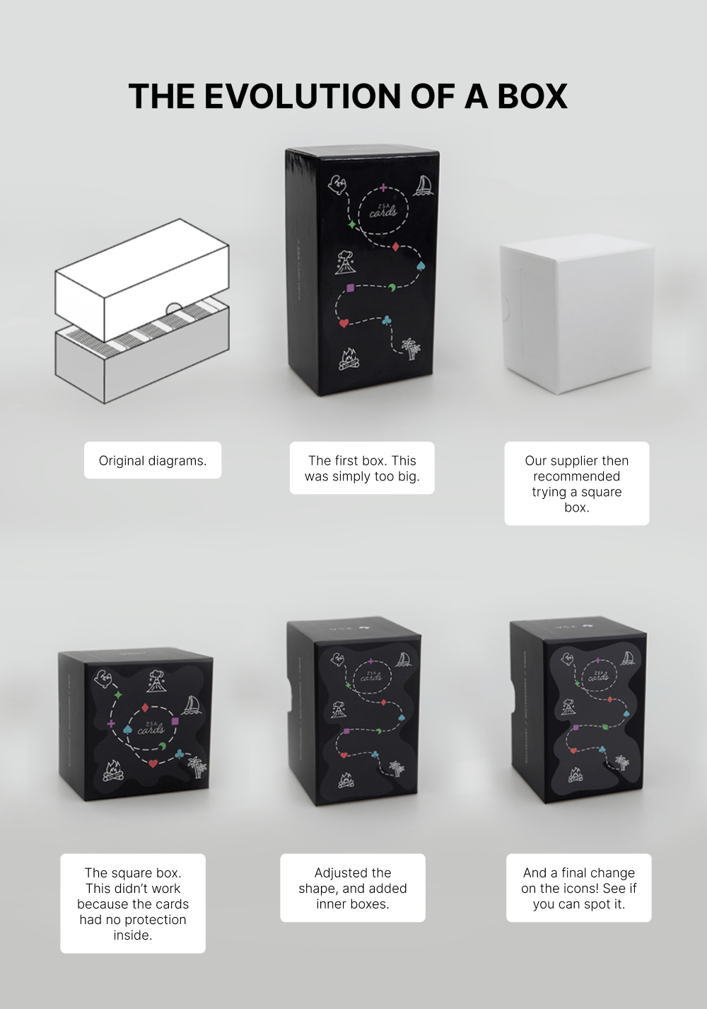
Next came packaging: We wanted a box that's beautiful but also proves useful over time. After testing many physical prototypes, we ended up with one sturdy external box and two pocket-sized inner boxes that let you carry just a portion of the cards in your pocket.
Over to you
I think it's safe to say that if you're reading this, you spend a significant portion of your life on your own, in front of a screen. I know I do.
A deck of cards like this can serve as a powerful avenue of connection, both with yourself and with the people around you — whether they're your loved ones or people you've just met. You can play a game, have a conversation, or tell a story.
I can't wait to see what you do. ZSA Cards are available now at the all-new site, zsa.fun.
